 If you’re a collector of historic newspapers, you know that front-page design underwent a seismic shift between the 19th and 20th centuries. Nowhere is this evolution more dramatic than in how publishers announced history-defining news.
In the 19th century, newspapers relied on stacked headlines [1] – a vertical sequence of bold, short phrases and illustrations packed into a single column. Without the technology to print massive type across the page, editors built suspense line by line. Take the April 10, 1865 issue of the Daily Evening Traveller [2] (Boston) reporting Lee’s surrender at Appomattox. The column reads like a drumbeat: woodcut eagles, exclamatory “HURRAH!” banners, and stacked subheads detailing the terms of surrender. It was a typographic ladder, guiding readers down through the overwhelming joy of the Civil War’s end.
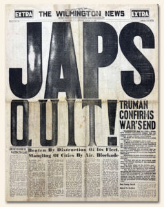
By the mid-20th century, layout technology and competition from radio transformed front pages into visual megaphones. Enter banner headlines [3] – giant, full-width typography designed to scream from newsstands. Look at the August 14, 1945 Wilmington News-Extra [4] announcing the end of WWII. The towering headline “JAPS QUIT” spans nearly the entire page, dwarfing every other element. It didn’t ask you to read down a column; it delivered an immediate, visceral emotional punch from across the street.
Both styles are masterclasses in drama. The 19th-century stacked headline invites you into a story with rhythmic anticipation, while the 20th-century banner stops you dead in your tracks.
Below are photos from our collection showing these two distinct eras of historic news design side-by-side!
Note: The stacked headlines from the April 10, 1865 Boston Evening Traveller may very well be the best we have ever seen for this historic event: