
Search
History of Newspapers Video (see more)
Email Subscription
Sign up to receive our latest blog updates!Buy Historic Newspapers

They Don’t Make ‘Em Like They Used To… Displayable Mastheads . . . A Lost Art
February 6, 2023 by Laura Heilenman · Leave a Comment
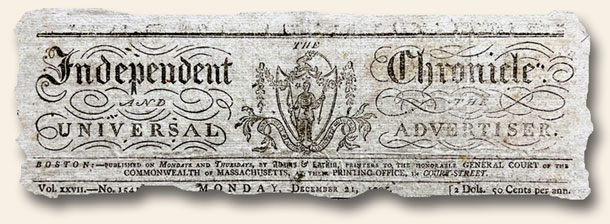 As citizens of the 21st century we are often aware of the diminishing quality we see in current products compared to the same items owned by our parents or grandparents (many technology-based items excluded). Perhaps the differences are due to available materials, the labor required to produce things, or perhaps a decreasing commitment to excellence (golly I’m sure sounding old). Case in point: Whereas pre-1850 newspapers, due to the cost of paper and “taxes”, were created in a very pragmatic way with every inch on a page packed to the hilt using a very small-font text, there was often one exception – the masthead. Consider the image above and the two newspapers from 1848 & 1849 shown in the links below. These issues are wonderful examples of the pragmatism of early printers combined with their desire of share beauty. Compared to today’s mastheads and graphic headlines, these newspaper publishers valued balance as they dispersed the daily or weekly news – blending both fascinating content and winsome artwork. Even today, decades or centuries later, these mastheads give me pause and solicit a deep appreciation for those who took the time to bring such charm to daily lives which were often devoid of significant beauty.
OLIVE BRANCH, Boston, November 10, 1849
Note: The 1850 date above was not a hard cut-off date. Newspapers such as The Liberator continued this practice well into the 1860’s, and a few other titles had wonderful mastheads well into the early 20th century.
Ways to collect: beautiful mastheads…
January 8, 2009 by TimHughes · Leave a Comment
 When I started collecting early newspapers many years ago, beyond the intrigue of something printed hundreds of years ago I was struck by the engravings found in the mastheads of many newspapers. I am still intrigued today, and I’ll admit that many of the newspapers found in our private collection are there because of their masthead engravings, not for their historic content. As a dealer one of my frustrations in the early years was publishing a catalog which did not accommodate photos. Later editions had a select few (most still do) but now many of our pricier catalog issues can be viewed online. And of course any newspaper we sell on our website or our eBay Store has multiple photos, allowing us to share the beauty of masthead engravings of centuries past.
 Eagle engravings are a favorite of mine and the variety available from the 18th & 19th century has to number well into the hundreds. The photo shows an issue of the “The Eagle”, the title apparently so obvious that the words never appeared in the masthead (but see the top of the first column). This is a rare title from Castine, Maine which lasted for only two years.
Themes in masthead engravings have been a focus of many of our customers. One man only buys newspapers with engravings of people shaking hands, and surprisingly I was able to find several for him.
What masthead engravings intrigue you? Do you have a favorite?