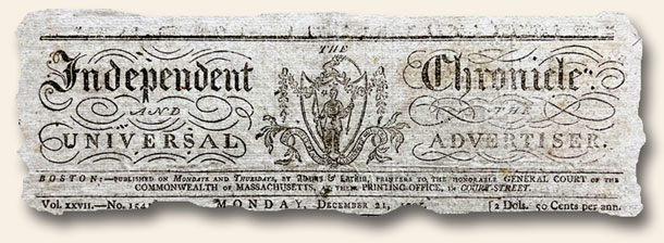
 As citizens of the 21st century we are often aware of the diminishing quality we see in current products compared to the same items owned by our parents or grandparents (many technology-based items excluded). Perhaps the differences are due to available materials, the labor required to produce things, or perhaps a decreasing commitment to excellence (golly I’m sure sounding old). Case in point: Whereas pre-1850 newspapers, due to the cost of paper and “taxes”, were created in a very pragmatic way with every inch on a page packed to the hilt using a very small-font text, there was often one exception – the masthead. Consider the image above and the two newspapers from 1848 & 1849 shown in the links below. These issues are wonderful examples of the pragmatism of early printers combined with their desire of share beauty. Compared to today’s mastheads and graphic headlines, these newspaper publishers valued balance as they dispersed the daily or weekly news – blending both fascinating content and winsome artwork. Even today, decades or centuries later, these mastheads [1] give me pause and solicit a deep appreciation for those who took the time to bring such charm to daily lives which were often devoid of significant beauty.
OLIVE BRANCH, Boston, November 10, 1849 [2]
BOSTON MUSEUM, Dec. 16, 1848 [3]
Note: The 1850 date above was not a hard cut-off date. Newspapers such as The Liberator [4] continued this practice well into the 1860’s, and a few other titles [5] had wonderful mastheads well into the early 20th century.